

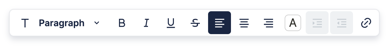
Formatting Toolbar
The Formatting Toolbar appears whenever you highlight text in the editor, and is mainly used for styling.
Custom Formatting Toolbar Element
You can create a custom Formatting Toolbar using a React component. The example below shows a basic custom formatting toolbar with four items. The first three are default items to toggle bold, italic, and underline, while the last one is a custom button which toggles the text and background colors to be blue.
Let's go over this code, starting with the CustomFormattingToolbar component, which is used to render the toolbar and takes the following props:
type FormattingToolbarProps = {
  editor: BlockNoteEditor
};
editor: The BlockNote editor instance to attach the toolbar to.
const CustomFormattingToolbar = (props: FormattingToolbarProps) => {
  return (
    <Toolbar>
      {/*Default button to toggle bold.*/}
      <ToggledStyleButton
        editor={props.editor}
        toggledStyle={"bold"}
      />
      {/*Default button to toggle italic.*/}
      <ToggledStyleButton
        editor={props.editor}
        toggledStyle={"italic"}
      />
      {/*Default button to toggle underline.*/}
      <ToggledStyleButton
        editor={props.editor}
        toggledStyle={"underline"}
      />
      {/*Custom button to toggle blue text & background color.*/}
      <ToolbarButton
        mainTooltip={"Blue Text & Background"}
        onClick={() => {
          props.editor.toggleStyles({
            textColor: "blue",
            backgroundColor: "blue",
          });
        }}
        isSelected={
          props.editor.getActiveStyles().textColor === "blue" &&
          props.editor.getActiveStyles().backgroundColor === "blue"
        }
      >
        Blue
      </ToolbarButton>
    </Toolbar>
  );
};
The components used to build this custom Formatting Toolbar are pre-made and come with BlockNote. These can be used if you need to change the functionality or layout, but want to keep the default styling. You can find all the pre-made components BlockNote offers in the Default Items and Custom Items subsections.
However, you could render whatever you like in CustomFormattingToolbar, allowing for fully custom designs.
Also, if you're unsure about what's happening inside ToolbarButton's onClick and isSelected props, head to Introduction to Blocks, which will guide you through reading & manipulating blocks in the editor using code.
After creating a custom toolbar and editor instance, we can add it to the editor by rendering it inside BlockNoteView:
export default function App() {
  // Creates a new editor instance.
  const editor: BlockNoteEditor = useBlockNote({});

  // Renders the editor instance.
  return (
    <BlockNoteView editor={editor}>
      <FormattingToolbarPositioner
        editor={editor}
        formattingToolbar={CustomFormattingToolbar}
      />
      <HyperlinkToolbarPositioner editor={editor} />
      <SlashMenuPositioner editor={editor} />
      <SideMenuPositioner editor={editor} />
    </BlockNoteView>
  );
}
There's a bit more we have to explain here though. First of all, let's talk about the FormattingToolbarPositioner component. Not only can you change what's inside the Formatting Toolbar and how it looks, but also when it's shown/hidden, as well as where it's positioned.
If you're looking to customize this to create, for example, a static Formatting Toolbar, head to Custom Formatting Toolbar Positioner. If you only want to change the toolbar element itself, you can use the FormattingToolbarPositioner to apply the default behaviour.
TODO: Text below is not final. We should change how we remove & customize the menus & toolbars. Take the scenarios:
- Customizing 1 UI element
- Customizing all UI elements
- Removing 1 UI element
- Removing all UI elements
By default, if you don't provide any children the BlockNoteView, BlockNote uses the default UI. However, if you want to provide a custom Formatting Toolbar, you should also add the default positioners for them (default components are used if custom ones aren't provided), as BlockNote won't render them otherwise.
This also means you can remove the Formatting Toolbar from the editor by only adding default positioners for all other menus & toolbars in BlockNoteView:
return (
  <BlockNoteView editor={editor}>
    <HyperlinkToolbarPositioner editor={editor} />
    <SlashMenuPositioner editor={editor} />
    <SideMenuPositioner editor={editor} />
  </BlockNoteView>
);type CustomFormattingToolbarProps = {
editor: BlockNoteEditor
};
const CustomFormattingToolbar = (props: CustomFormattingToolbarProps): JSX.Element => ...;However, this means you also have to handle showing, hiding, and positioning the Formatting Toolbar yourself. While this allows for additional customization, there are a lot of cases where you only want to change the toolbar itself and not have to deal with all of that. Therefore, BlockNote provides a FormattingToolbarPositioner component which handles showing, hiding, and positioning for you:
import {
  FormattingToolbarProps,
  FormattingToolbarPositioner
} from "@blocknote/react";

const FormattingToolbarPositioner = (props: {
  editor: BlockNoteEditor,
  formattingToolbar?: (props: FormattingToolbarProps) => JSX.Element
}): JSX.Element => {
  ...
},
You can then tell BlockNote to use your custom Formatting Toolbar by adding it as a child of BlockNoteView:
import { BlockNoteEditor } from "@blocknote/core";
import {
  BlockNoteView,
  FormattingToolbarProps,
  FormattingToolbarPositioner,
  useBlockNote
} from "@blocknote/react";
import "@blocknote/core/style.css";

const CustomFormattingToolbar = (props: CustomFormattingToolbarProps) => {
    // Define your custom toolbar here component here
    ...
};

function App() {
  // Creates a new editor instance.
  const editor: BlockNoteEditor = useBlockNote({});

  // Renders the editor instance using a React component.
  return (
    <BlockNoteView editor={editor}>
      <FormattingToolbarPositioner
        editor={editor}
        formattingToolbar={CustomFormattingToolbar}
      />
    </BlockNoteView>
  );
}
Default Items
It might seem daunting to create your own Formatting Toolbar from scratch, which is why BlockNote provides React components for everything you see in the default layout and more - both the toolbar itself and the items in it. Below are all the default components you can use to build your custom toolbar:
// Toolbar which wraps all the items.
type ToolbarProps = {
  children: ReactNode;
};
const Toolbar = (props: ToolbarProps) => ...;

// Dropdown which changes the block type.
type BlockTypeDropdownProps = {
  editor: BlockNoteEditor
};
const BlockTypeDropdown = (props: BlockTypeDropdownProps) => ...;

// Button which toggles a simple style on the highlighted text.
type ToggledStyleButtonProps = {
  editor: BlockNoteEditor;
  toggledStyle: "bold" | "italic" | "underline" | "strike" | "code";
};
const ToggledStyleButton = (props: ToggledStyleButtonProps) => ...;

// Button which sets the text alignment on the block.
type TextAlignButtonProps = {
  editor: BlockNoteEditor;
  textAlignment: "left" | "center" | "right" | "center";
};
const TextAlignButton = (props: TextAlignButtonProps) => ...;

// Button which opens a dropdown on hover. The dropdown lets you set the
// highlighted text's color.
type ColorStyleButtonProps = {
  editor: BlockNoteEditor
};
const ColorStyleButton = (props: ColorStyleButtonProps) => ...;

// Button which nests the block, if it can be nested.
type NestBlockButtonProps = {
  editor: BlockNoteEditor
};
const NestBlockButton = (props: NestBlockButtonProps) => ...;

// Button which unnests the block, if it can be nested.
type UnestBlockButtonProps = {
  editor: BlockNoteEditor
};
const UnestBlockButton = (props: UnestBlockButtonProps) => ...;

// Button which opens a dialog box to create a new link.
type CreateLinkButtonProps = {
  editor: BlockNoteEditor
};
const CreateLinkButton = (props: CreateLinkButtonProps) => ...;
Custom Items
BlockNote also provides components that you can use to make your own toolbar items, which match BlockNote's UI styling:
// Custom dropdown.
type ToolbarDropdownProps = {
  // Array representing the items in the dropdown.
  items: Array<{
    // Item name/text.
    text: string;
    // Icon next to the text.
    icon?: IconType;
    // Function to execute on click.
    onClick?: (e: MouseEvent) => void;
    // Condition for when the item is selected/active.
    isSelected?: boolean;
    // Whether the item should be clickable.
    isDisabled?: boolean;
  }>;
  // Whether the dropdown should be clickable.
  isDisabled?: boolean;
};
const ToolbarDropdown = (props: ToolbarDropdownProps): JSX.Element => ...;

// Custom button.
type ToolbarButtonProps = {
  // Main tooltip, which is shown on hover.
  mainTooltip: string;
  // Secondary tooltip, usually showing the keyboard shortcut.
  secondaryTooltip?: string;
  // Icon for the button.
  icon?: IconType;
  // Function to execute on click.
  onClick?: (e: MouseEvent) => void;
  // Condition for when the item is selected/active.
  isSelected?: boolean;
  // Whether the item should be clickable.
  isDisabled?: boolean;
  // Child components, usually just the button text. If no children are
  // given, make sure to provide an icon.
  children?: any;
};
export const ToolbarButton = (props: ToolbarButtonProps) => ...;
Custom Formatting Toolbar Positioner
TODO